Do you spot the differences between Serif and Sans-Serif fonts as you browse through the ready made cover art available to you on Album Cover Zone?
To lay it down quickly:
-
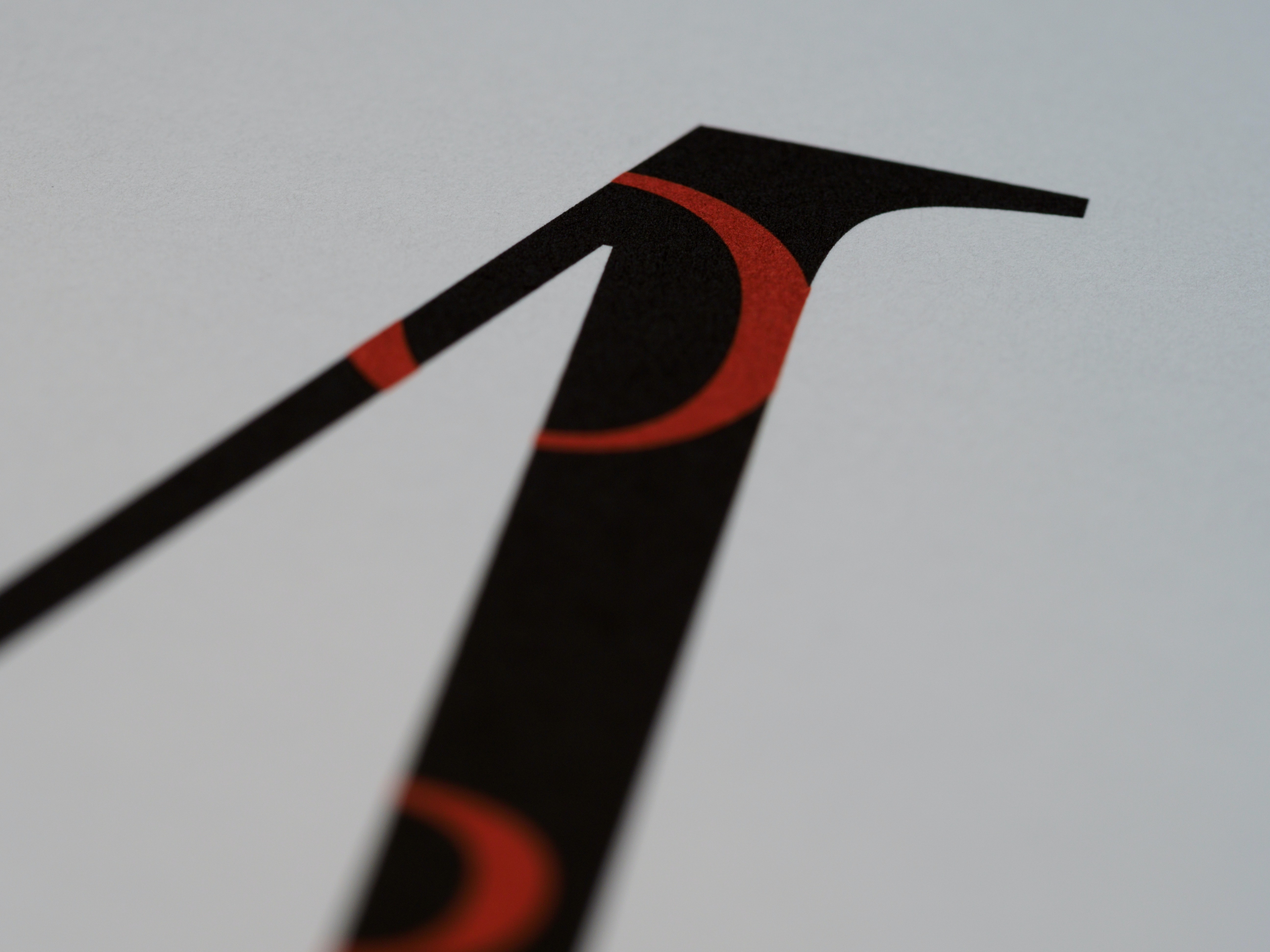
Serif fonts have the so oftenly called “tiny feet” that extend from the letters, they are the small extra strokes at the end of the main endings of the letters, which give a more decorated look to them;
-
Sans-Serif fonts usually have a more plain and bold look (because they don’t have the extra feet, thus Sans-Serif - “without serif”);
Serif and Sans-Serif are not only two types of font - they are font families, or typefaces.
Just within the two of them you can find hundreds, maybe thousands of fonts. The possibilities for variation within each typeface are unlimited, and is all up to the ingeniosity of typographic artists to create them. It is remarkable how much variety there is in a simple, yet so powerful, thing such as adding and removing the extremities of a font, or altering the placement, size, or style of them. Our designers consider font choosing a very important step in the creation of high quality album covers. As you will see with the continuation of this post, fonts have a huge role in conveying the right information from your album cover to your audience.
Usage
Once you start catching consciously the differences between Serif and Sans-Serif you begin to notice where you can find more of one font or the other. Their details convey different messages and help the reader to perceive better the written information, be that your band name, or your album title.
Serif fonts are commonly applied to long text styles - to share large quantities of information. They allow an easier long-term reading, more natural and connected (to name a few; Times New Roman, Palatino, and Georgia. Do you recognize these names?)
In the case of Sans-Serif fonts, you will most likely find them in places that intend to convey short and direct messages to you. Their plain visuals allow a fast detection of the word, making it ideal for road signs, billboards, car plate numbers, and so on (to give a few examples to this typeface; Arial, Helvetica, or Futura. Fonts loved by the designers of AlbumCoverZone!).
But Why This Difference in Usage?
Clearly, it has to do with helping the reader read better in both long and short texts or single words, but it also has to do with how people perceive the qualities of each font. Let’s dive deeper!
Serif fonts are generally considered to be elegant, to convey a formal and established presence, and to be more classic, hence you can see many classical music album cover with serif fonts. Not only do they look more classical, but also have a very important historical weight, which is carried to the character and meaning of the font. The exact origin of serifs is unknown but there are various established theories. One of them comes from the fact that the latin alphabet, being rooted in the Ancient Roman tradition of writing, carried their tradition in the style of typeface. Back then, the stone carvers marked the letters with serifs to clean the endings of the lines carved on to the stone, so it was a solution for quite a different challenge. This practice carried on throughout the evolution of the latin alphabet, and it arrived to our days carrying a very relevant weight and tradition. That is why we associate historical music, such as early music with the font families that have serif too, and you see so many early music album design with serif fonts as well.
On the contrary, Sans-Serif fonts as we know them were established from the 19th century on. Does the Industrial Revolution ring you any bell? Exactly, with the coming of mass production, mass marketing, and ever faster ways of communication, Sans-Serif usage spread incredibly fast, becoming one of the most commonly used typefaces. This is one of the reasons in contemporary music album covers we often see Sans-Serif fonts. An album cover designed to include “new content” in it will often use Sans-Serif fonts. The music represented with these fonts doesn’t have to be very classical and serious music, you see this in alternative rock album covers, pop album covers, and many other styles. Sans-Serif is seen to be the style that conveys the most various styles.
Now returning to the 21th century... our excellent designers choose their fonts carefully based on the message they believe you will be conveying to your audience. By browsing our premade album cover library, you can find various contexts and usages for these two types of fonts, even cases in which the traditional rules for font choice are broken. Ultimately, the equation that will transmit the message on our unique album covers, consists in finding a balance between quantity of text, placement, size, and font choice, in relation with the art on the cover.
Need a cover with a traditional touch? Check out where those Serifs hang-out. Wish to get a cover that will cause an impressive and modern impact? Be on the lookout for the Sans-Serifs! Move on to our online catalogue of premade album art, and choose your new, amazing, and unique covers!