Category: Begin

Create Double Vision Effect in Photoshop
Check out this cover in the shop So, you're diving into the wild world of double vision for your album art, huh? You've got this creepy monster vibe going on – don't worry, we've all been there with our creative brainchildren! But hey, you're right, that eerie look can totally morph into something cool and expressive, like peering through the blurry veil between dreams and reality, or maybe the sonic equivalent of a head-scratching "wait, what just happened?" kind of tune. Or, you know, just the general fuzziness of a chill, spaced-out track. The musicians are the magicians here, spinning their audio tales! Now, let's peek at these image tricks you've got up your sleeve. You're spot on – there's a whole playground of ways to get that double take effect in Photoshop. First up, the "Multiply" mode! You call it simple, and you're not wrong. It's like the no-fuss, grab-and-go option for a quick visual echo. Then comes "Motion Blur," which definitely kicks things up a notch, adding this cool, drawn-out, slow-motion feel. You can really dial in the drama with that one. And ooh, the "Grain Effect in One Color Channel" – now that's where things get a little vintage and groovy! It's like your image had a wild night in the past and is still seeing double, plus you get that sweet, grainy texture. Twiddle those intensity knobs to match the musical story – I dig it! But for today's adventure, you're sticking with the "Multiply" method. Smart choice for keeping it breezy! Multiply is about applying the "Multiply" layer filter to your layers. Step 1: Duplicate the subject by selecting the subject with the selection tools(ex: Lasso Tool, Quick Selection Tool, AI Select Subject .etc.) and create a new layer from it. Step 2: Place the new layer on top of the original image layer. Apply "Multiply" layer filter to the new layer you've just created. Step 3: We are going to make adjustment now. Depends on how you want to express it, move this new layer toward left or right a little or scale it a little larger, and adjust the layer's Opacity based on the result you want. Step4: Apply the same logic and create more layer from the same subject like that. Don't forget to adjust the opacity to each layers. This is it. With multiply layer filter and opacity adjustment, it creates double vision effect easily.

16 Double Exposure Effect Covers
Everybody Loves the Double Exposure Effect! Double exposure effect covers have a way of capturing attention instantly—melding two separate images into a single, dreamlike composition. Artists and audiences are drawn to these covers because they evoke mystery, emotion, and depth at a single glance. This visual style often hints at the layers and complexity found within the music itself, suggesting that the songs tell stories that overlap, mix, and reveal hidden meanings. Whether you’re releasing indie folk, electronic, or alternative tunes, a double exposure cover sets a mood even before the first note plays, telling listeners that your sound is as intriguing and multifaceted as the art that represents it. Our latest 16 covers with double exposure effects. Double Exposure Album Covers Grid .grid-container { display: grid; grid-template-columns: repeat(4, 1fr); gap: 24px; max-width: 1000px; margin: 40px auto; padding: 10px; background: #fafafd; border-radius: 12px; } .cover-cell { background: #fff; border-radius: 10px; overflow: hidden; box-shadow: 0 2px 8px rgba(0,0,0,0.06); transition: box-shadow .2s; text-align: center; text-decoration: none; color: #222; display: flex; flex-direction: column; } .cover-cell:hover { box-shadow: 0 6px 20px rgba(60,80,200,0.15); } .cover-img { width: 100%; display: block; aspect-ratio: 1 / 1; object-fit: cover; background: #e8e8e8; } .cover-caption { font-family: 'Segoe UI', Arial, sans-serif; padding: 10px 4px; font-size: 1rem; font-weight: 500; letter-spacing: 0.01em; background: #f7f8ff; } Conch #11752 Moon Mist #11750 Bunker #11792 Oxford Blue #11785 Outer Space #11784 Japonica #11779 Outer Space #11776 Pickled Bluewood #11775 Tana #11772 Pickled Bluewood #11761 Cameo #11763 Lynch #11764 Japonica #17409 BlueDianne #17408 ElPaso #17110 Scorpion #17077
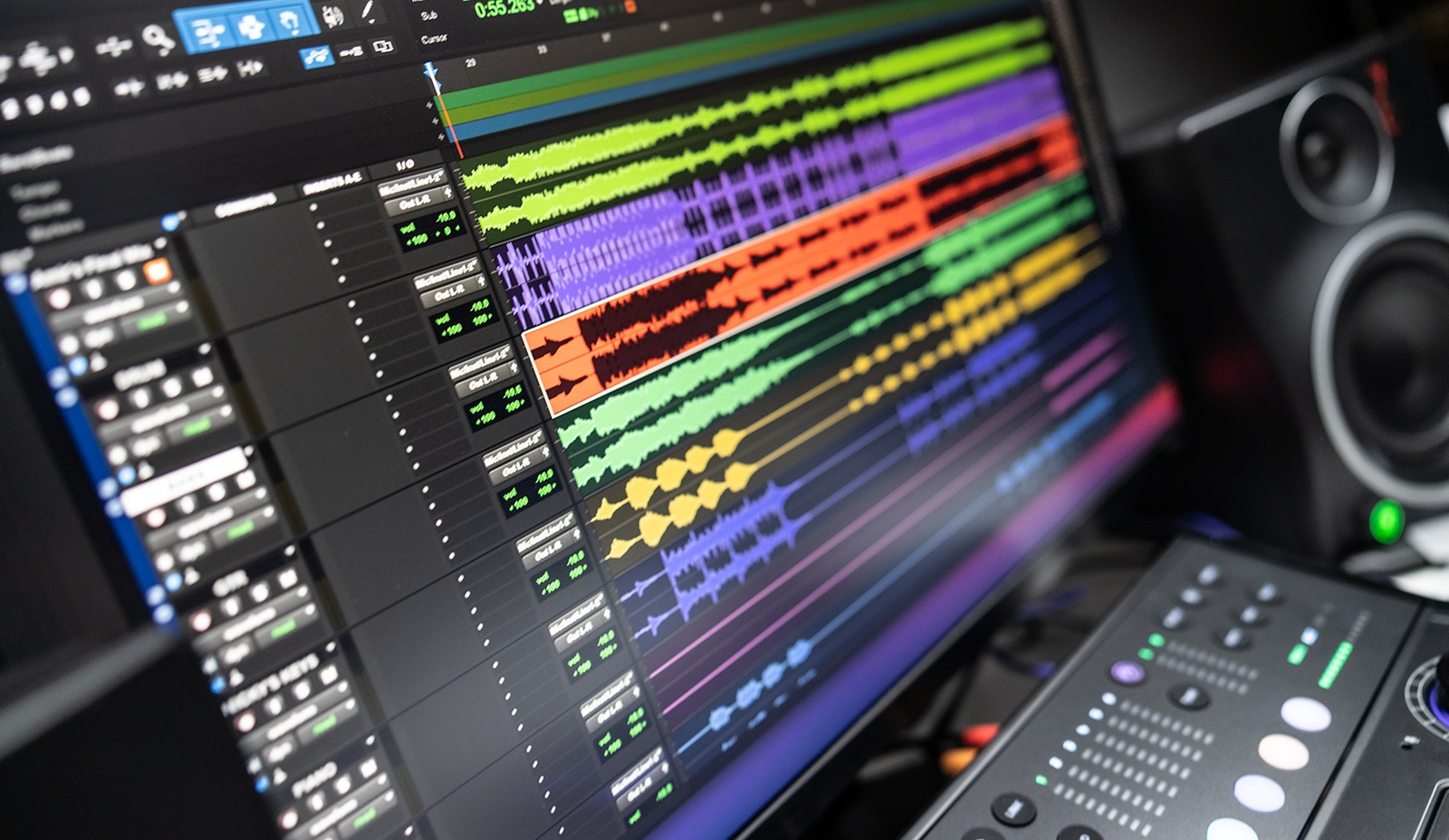
Sound Evolution: The Story of the World's First Digital Audio Workstation
The story of the first Digital Audio Workstation (DAW) is an intriguing journey through the evolution of music technology. The consensus among historians and technologists is that the British company, Soundstream, which was founded by Thomas Stockham, a professor from the University of Utah, developed the very first digital recording system in the late 1970s. This system wasn't a DAW in the modern sense, but it was a crucial stepping stone towards the development of modern DAWs. Stockham, known as a pioneer of digital audio, used a computer to record sound on a digital tape, marking the first time a computer was used for sound editing and processing. The Soundstream system, although revolutionary, was primarily a digital tape recording system with basic editing features, such as cut, copy, and paste, which were operations performed with a digital representation of the audio signals. The journey from Soundstream's digital recording system to the first true DAW involves another significant development - the Fairlight CMI (Computer Musical Instrument), released in 1979. The Fairlight CMI was more of a digital sampler and synthesizer than a comprehensive DAW, but its ability to sample sounds, along with a rudimentary sequencer and a digital synthesizer, laid the foundation for the integration of computers in music production. However, the title of the first true DAW is widely credited to the Sound Tools system, introduced by Digidesign in 1989. Sound Tools was a computer-based system that allowed direct-to-disk recording and stereo editing. Running on the Macintosh platform, Sound Tools offered a graphical user interface that allowed users to visually manipulate audio waveforms. This was a revolutionary development, as it provided an unprecedented level of control over audio editing and production, shifting the paradigm from linear tape-based editing to non-linear, non-destructive editing on a computer. This innovation by Digidesign paved the way for the Pro Tools system, released in 1991, which expanded upon Sound Tools by offering multi-track recording and further advanced editing features. Pro Tools is often considered synonymous with the modern concept of a DAW, providing a comprehensive suite of tools for recording, editing, mixing, and mastering audio within a single software environment. The development of the first DAW is a cornerstone in the history of music production, marking the transition from analogue to digital, and from physical to virtual tools. This technological evolution has democratized music production, making it accessible to a broader range of artists and producers, and has forever changed the landscape of the music industry.
Seeing Music: Exploring The Color Palettes of Genres
Music transcends auditory dimensions and taps into our multi-sensory experiences, with color playing a pivotal role, subconsciously influencing our perceptions of different genres. Each music genre has seemingly adopted its own color palette, shaping album art, promotional materials, and even live shows. But what are these color choices, and what popular albums exemplify them? Pop music, an epitome of dynamic vibes, frequently employs vibrant tonalities. The candy-floss pink of Katy Perry's 'Teenage Dream' or the bold purple of Prince’s 'Purple Rain' encapsulates its playful charm. The Rock genre, communicating unfiltered energy and intensity, is awash in deeper hues. Classic albums like AC/DC’s 'Back in Black' and The Beatles' 'The Red Album' are testaments to the genre's bold palette. Country music leans into earthy and authentic hues. The rustic greens and browns of Keith Urban's 'Be Here,' or the tranquil cream tones of Kacey Musgraves's 'Golden Hour' tap into the genre's roots. Electronic music, setting the beat for the future, embraces neon colors. Albums like Daft Punk’s 'Discovery' embody the digital, pulsating essence of this music genre through its resplendent blue shade. Hip-hop, a genre steeped in the contrast of struggle and opulence, swings towards bold blacks, whites, golds, and reds. Kendrick Lamar’s 'DAMN.' and Jay-Z/Kanye West's 'Watch the Throne' serve as excellent color samples, as they radiate power and resilience, respectively. Jazz, a genre defined by emotional depth and improvisation, opts for a traditional palette. Albums like Miles Davis' 'Kind of Blue' and John Coltrane's 'A Love Supreme' offer perfect examples with their serene hues and vintage charm. Blues, Reggae, Classical, and Metal music also have their distinct color palettes, each reflecting their unique atmospheres, themes, and emotional intensity. While these palettes don't directly influence the sound of music, they undoubtedly shape our understanding and perception of them. Colors weave visual elements into our auditory experience, allowing us to 'see' music, as we hear it. So, next time you listen to your favorite song or album, consider the colors that come to mind. How does that enrich your experience as a listener? Rather fascinating, isn't it?
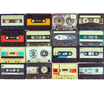
Getting Physical or Going Digital? The Two Sides of Music Publishing
Your friend tells you that you are gonna love this new song he taped from the radio, and passes you a copy. No, but seriously; Where do people get their music? The Listener goes into a record store, talks with a fellow shop owner, and asks about that new album that is released the other day. She tells her that the new release is sold out but that she put aside one album in the LP format, having had The Listener in mind. The Listener walks across the street as your soon-to-be-fan, hears you busking your beautiful music. She might not want to interrupt the flow or might be too shy to start a chat with you between songs. The only way to have your music at hand for her is to get your CD with your latest released single in it. At a festival, where there are hundreds of new bands blossoming, The Listener likes you the most, especially with that eye-candy album art of yours. Conscious fans will most likely prefer to support you by buying your physical music album rather than paying you 1 buck or 0.0000017 cents per listening via major music streaming platforms. Your manager scored a nice record label, now your album has a place in the aisles of a chain store that has huge shops in malls. The Listener is hearing some music in the background, waiting for the movie in the cinema next door to announce the last call and he is browsing the CDs almost in idle mode. One of the covers reminded him of something, something he couldn’t put his finger on, but its so attractive that he grabbed the album and flipped to look at its backside. You have him. Still, since copying cassette tapes for sure our society has changed. If not changed the old habits, it certainly gained new ones. Many people live with the feeling that every wish is a mouse click away. The ability to instantaneously acquire anything re-shaped the way the listeners consume music. According to the industry leaders, the music streaming market has grown so much in the last years that it is surpassing the sales of physical copies. Also according to them, the consumers were in need of such service they provide. We were, indeed, in need. The musical identity has developed to the extent that your collection is not made out of one genre or few bands or orchestras anymore, you don’t have to wait two years for your favorite band to release a new album. You and everyone else are motivated to discover new music, every single week. And the musicians are motivated to release singles, collections, and live shows to stay active and be visible at all times. Between years-lasting productions of new work, not just the recently found ones but the most world-famous bands are busy reaching out for more audience. The new release count is rising every year, which means owning every single music of interest in the house from the past 10 years in physical format would require more space than the good old CD shelves that are limited to 50, maybe 100 CDs. Many record stores were motivated/pushed to change the way they run their business. No longer is the record store the one and only place where you can access your favorite music. Nowadays most stores rebrand themselves as the place where you mostly go to obtain that very special item for your unique collection of CDs, LPs, and cassettes. More than ever, physical albums are becoming treasured artifacts not because listeners get them due to the fact that it’s the only way to listen to the music, but because LPs and CDs serve as symbols of identity. You only own the music that is really special to you, the one that represents you. AlbumCoverZone is building the largest collection of album covers in response to the online streaming market, where the market is fast and vast, but we also offer formats for physical publishing. You can contact us to have an album cover based on the front cover you choose and our team of designers get down to business so that we can complete your booklet, CD label, back and side included album cover design. Our cover designs are the faces of numerous artists who are making their career in the online market, but they also belong to the private album collections in living rooms, for proud listeners to show their identity.

First Steps of Production Strategies
Music is one of the most abstract creations out there. It involves physical effort but the result still stays as something “invisible”. Yet it can be the most concrete way to describe something; such as the heartbeat. Having a vision of an end product is sometimes just not enough. To reach there, the musician or the musicians and their production team need to come up with a plan. There is plenty to think about from styling the visuals to the language and character of the online advertising profile because this abstract end-product that all musicians spend their lifetime to “better”, needs to be presented as physically as possible. Below are some strategic decisions that are recommended for starting projects to consider; making the choice from the beginning can prevent a huge headache in future steps. While planning the visual and physical forms that represent their songs, musicians often draw a whole world around them. The audience picks this up mostly unconsciously, but sometimes the “look” gets so much associated with the “sound” that a writing style, a clothing style, or a color palette can be associated with a certain type of music or musician. This does not have to be seen as a rule, since there are music styles that one can’t associate with “a” style of clothing, or “a” style of design, but even then, various visual styles can hint at the “sound” of the person, persona or product. A musician on the ladder must then analyze the strategies of their heroes and heroines. Given examples only concerning the visual end of some of the most deservingly famed artists; Björk and Lady Gaga’s constant out-of-the-box thinking, Madonna’s success in constantly updating herself to the current and changing the current from within can be given as examples of the look and the style from the bold end; whereas black-and-white headshots where the members are in their most transparent and genuine selves, the bands Travis, Coldplay and Radiohead do not ask for this bold of a distinguishment from their audience, they distinguish themselves from the others with other means and forms. So, even within the “image” of the person/persona/product one can have different desires. Wanting to “be one with them”, or wanting to “be the only one” addresses different consumers and audiences. This reflects on the sound as well. Most indie genres are products of people who started their path with what they had; without climbing to the top of the financial ladder, they wanted to show the audience that it is the “idea” that counts rather than the hi-finess of the music. And often, as long as the music is good, the audience receives the means beyond the quality and famed the low-budget bands to a level that the many indie bands gained the means to provide hi-fi music. This type of separation can also be seen in the approach towards the audience; bands that use “We” in public announcements certainly want to link to their audience on a more personal level while the bands and people that use “They” to refer to themselves are projects with a need to sit on a different position than their audience. Both approaches come with a need or an idea behind them, so it is important to make this choice at the start and keep the sympathetical, cool, kind, aggressive, bold, serious, glamorous, or down-the-earth approach stable. Within the presentation of the individuals, one can also see a difference. Britney Spears Rihanna or Yann Tiersen don’t exist on stage alone (often), yet (often) they do not present themselves teaming up with their bands like Nick Cave and the Bad Seeds, Adam and the Ants or Bob Marley and the Wailers would or did. These all lead the audience to various conclusions and sometimes are strategies of the production. It is good to keep an eye on the current fashion of naming of the existing projects; and one should always remember, even when going on a solo career, it is a good deed to give credit to the people who walk to the same stage with the solo artist! Visual unity is another topic that can be discussed and justified from two totally different ends. Some bands and musicians like to stick to the “logo”, while others shift their visual and text style from album to album to reflect the content of the album to its most. There are so many names that we know today as strict as a brand that never associated themselves with a logo. Each album Sting comes with a unique layout, as Leonard Cohen and Adele, but we know their consistency does not rely on their font choice. Meanwhile, Metallica can change their sound to the most modern edge with every single album, go out of their classical heavy metal roots, or “reinvent heavy metal” as some say, but they bring their spirit on their logo to every single product they create. Blind Guardian and Dream Theater members can change here and there, but the logo and the image of the band stay as invented in the first place. So both choices are valid, the important part is to decide on one and keep it running. Here at AlbumCoverZone we can help you with the last decision to make. Next to our hundreds of uniquely designed covers, we also provide customization services in many forms. If you want your album to have your own logo, our design team is here to place it on an album art that you enjoyed from our ever-growing unique selection. If you enjoyed the layout of an album but you want your artist/band photography on it, we can sort that out as well. All you have to do is contact one of us via the support@albumcoverzone.com to learn the possibilities. When you work with AlbumCoverZone to release your single or album, you do the music, and we cover the rest.

Timeless Designs
Ever wondered how sometimes you can guess the year an album was made based on the album design?Some of the important album art made in the ‘50s had a very specific approach to the text layout, giving it artistic importance, where one letter turns out to be an arrow that goes through all the other letters, or texts written entirely backward on the background while the title of the album is “reflections”, or the entire album cover is full of exclamation marks while the title is “it’s time!”. To give a few, in the ‘90s most text was there to present the title and the artist’s name, with a hint of character, but it was the image that counted. From the 90’s we remember things like “it’s the album with the piano on the cover” “it's the album where they all wear white on the cover”, and “it's the album with the red-haired woman”. This shift didn’t happen overnight. Aside from the “headshot and the hip font of the year” combination, the 60s and 70s significant album cover designs were based on illustrations that relied heavily on montage and collage and artwork that was blended with the text. 80s mainstream started exploring photography and artistic effects even more on album art. The late 90s were a result of pursuing a more mild taste after these overly intense flavors. In the 2020s, if we see an album cover design that relates to one of these approaches, we can already picture more or less how the album is gonna sound like. We expect the rap to fall out of the first track, the grunge guitar tone to come up, the bebop licks to surround us, the high-pitched male singer to cry his heart, and all that jazz. But! How about the 2000s till now? How about the time we saw the rebirth of retro, the comeback of the folk, how about the old-school rap, hip-hop, and metal that boosted the charts again? How about the contemporary classical music of 50 years ago performed today? How about independent labels growing into a genre in a decade by themselves? How are we going to present them? Sometimes the album covers purposely misinform us, to hint us the style of music behind the cover rather than the year it has been made. This was not a gigantic necessity when labels and mainstream radio channels were the ones on the thrones, with more significant power than they have today since if the sound was not convincing enough to either create something new or to keep up with the current interest, the projects would get refused, hence not many genres and styles were gaining visibility at the same time in order to not dilute the market. But today, independent artists have quite a few chairs in the market too, next to the thrones. More than ever. If you want your album to have the signature sound of the ‘70s folk, you can achieve that, you can produce that and you can find a buyer for that album since music tastes are not as saturated as they used to be with the freedom provided by the music streaming platforms. What could not have been produced by major labels back then is welcomed in the official market today, not just in the local bar where the band meets. If your 80s-style covers of 2020 pop songs have the potential to become a hit on iTunes, no one is there to stop you. Strange enough, the mass media, noticing this capacity of independent musicians and the interest of the audiences, changed the gear of mainstream music as well. Today, most of the current chart position holders have at least a few unplugged singles, or an acoustic album here and there, since independent artists brought back the folk, by giving it a re-rebirth. Numbers don’t lie, and interest in people towards the simple-yet-powerful singer-songwriter grew to such a level that grand names like Taylor Swift got to start a down-to-earth folk album after numerous glamorous pop albums. But now, that album needs to have a folky album look, doesn’t it? This is why, since the millennium, the number of stylistic differences began growing exponentially in the album design world. Not just based on genre, but also based on the era within the genre they represent. You have your modern rap, your ‘90s rap, and all the things in between that fall under the same category, yet have their unique looks on the album covers. Today’s independent musicians have the right to produce in all these subgenres, without a boss saying “that’s the trend of five years ago, don’t do that.” You have your alternative rock with the ‘00s sound, and you have your alternative rock with your ‘10s sound. One has a bit more glamour in its album cover design than the other. One album cover ought to look more scratched and used-looking than the other, since the profile that listened to the genre got richer in time, creating space for more underground genres to flourish. Meanwhile, if today you want to produce with the old grunge sound, you do want to reflect that on your album design as well. What independent musicians made major producers realize is this; the audience that likes a sound is still liking it, and wants more of it, not the next jumbo burger menu the market is going to invent. Modern trends can not provide the looks for what you want to tell at all times. This is why, retro looks, vintage looks, LP-like feelings, specific font layouts, the ink-feel and various color codes of certain decades, and certain subgenres keep on becoming part of the modern album cover design pool today and the trend is including “timeless designs”. Ironic. And since AlbumCoverZone is here to provide a high-end quality look for independent musicians to find themselves the place they deserve on the charts, we greatly care about being able to cover all stylistic subgenres in our album cover art catalog. This is why, if you go into our Heavy Metal album covers category, you will find cover designs that present a certain era, a certain old-school to it, as much as album covers fitting to numetal sound of the 2000s, and more modern, dark, prog, electronic album cover design elements of the 2010 and 2020s. If you hit our modern jazz section, you will find what modern jazz “used to look like”, side by side with what modern jazz “is currently looking like”. Depending on your preference, depending on the message you want to pass to the audience for them to connect to you, you can make a choice. We got you covered.
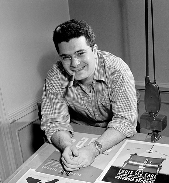
On Alex Steinweiss and the Short History of Album Cover Art
Music was never directly associated (if not recommended by the composer) with visual arts for many centuries. Although this could hint at the idea that “music has an abstract meaning”, the actuality was that music was never associated with circumstances where the musician was not visible either. Experiencing music meant seeing the creators of it, and being in the same room with them; being an audience was an experience as visible as it was audible. Yet, while the history of visual arts goes way way back, and even the history of advertisement goes a little way back, album cover design has a relatively short history. Starting no longer than 80 years ago with its invention, credited to the graphic design artist Alex Steinweiss (March 24, 1917 - July 17, 2011). Recording industries brought music to an abstract field, where the audience didn’t need the musician at hand to hear the music. This created a gap that needed to be filled, where the music needed to be represented by a still image to describe to the audience what they were about to listen to. Before the recording technologies, this was done by the costumes of the musicians, the decoration of the hall, and the decor of the stage, but now we needed all that info in one square the size of an LP. But this was discovered much later on! When disc records replaced the phonograph cylinder around 1910, they were usually sold in plain brown paper or in cardboard sleeves, at most they would have printed the producer or retailer’s name -and that was it. Only about three decades later, in 1938, when Alex Steinweiss was assigned as the first art director to Columbia Records, began the adventurous history of the album covers and a new field of illustration was created - the album cover art. Alex Steinweiss’ album designing career counts with a rough amount of 2.500 covers. He first began working for Columbia Records, but designed later for other record labels such as Decca and London Records. Steinwess’s creations have become iconic, being the very first samples of this art form in the history of humankind. He had a design style of his own, grabbing the viewer’s attention with the use of vivid colors, bold graphics, and original typography. He made the cover art for all major genres of classical, jazz, and popular music, giving a face to the music of important composers such as Brahms, Prokofiev, Tchaikovsky, and notorious musicians including Louis Armstrong, and David Oistrakh. The revolutionary idea of the 23-year-old designer led other record companies to hire their own art directors and by the end of the 1940s, all major companies were releasing albums on colorful paper, reproducing classic art, or presenting their own original designs. At first photographs of the musicians were often used, but later on, visual arts started to be associated with various music genres as well. Jazz and contemporary music -the fresh music of the West those days- were associated mainly with contemporary, fresh art of the same period, while classical music was also matched with era-related paintings, hence today when you see a still-life painting of a bowl of fruit, or a big field with marvelous mountains, you know that you are about to hear some symphonic stuff at least. In the same way, abstract paintings with harsh post-war influences immediately call for bebop and its contemporaries. Today’s big record labels still follow the idea, but tweak it from time to time; it is getting more common to see classical albums with flashy, fresh out of the atelier artworks. The musician portrait used in album covers also shifts their style from decade to decade as well. Even the “solo singer pose” has a fashion depending on the era an the style of music. Most portrait/photograph-used album covers hint at their style starting from the outfit/make-up, the camera angle, the background, and the lightning of the subject. The technological development of the products also had a big role in the design industry. While LPs gave space for bold and big images carried on with very small text that still would be readable considering the size of the surface, CDs and cassettes created a totally different layout to represent music. Text areas got bigger and the often-used “artwork-typography” that would cover the entire surface of an LP cover fell out of fashion due to readability. Today’s online platforms adopt the CD layout as their basis so when a band, an orchestra, or a solo artist produces a CD, it immediately matches the online profile as well. Here at AlbumCoverZone, our products are designed to match both needs of musicians. Dimensions of our album cover art are big enough to be used HD in online music streaming platforms, they are also in printable size to become your next CD cover. For LP-sized products, you can always contact us, our designers are here to help you out with large-size images suitable for your products. Alex Steinweiss is known as the pioneer of album cover art, with respect and awe in our hearts for him, we know that we will be known as the pioneers of premade album cover art. Official webpage of Alex Steinweiss and his work:http://www.alexsteinweiss.com/

Changes in Becoming Visible
We go to music stream platforms, full of content, full of suggestions, heavily filled-up playlists, and input from the friends and colleagues we follow… It became a much different experience to discover new music than when it meant going to a record store and browsing through the shelves, looking at CDs one by one. We would be at the mercy or under the blessing of the record store owners, depending on their willingness and talent to discover fresh and good music. Today AI systems, full-time working playlist designers, and willing-to-share listeners are suggesting to us what to discover next, but is it always as helpful as we think it is? Deciding to purchase a CD without knowing what was in it (maybe besides that one hit song that we kept on hearing on the radio) certainly came with its own excitement that today’s technology successfully erased from our lives, still, we discover cool stuff while streaming new content, hopefully at least sometimes based on pure luck. How do we decide? What makes us click on this album rather than that album? That decision is made very quickly and sometimes is done almost without thinking. When all the possibilities are visible and one click away, hunting someone down to discover your music stays as challenging as it used to be, when the way passed through appearing in radio stations, getting into the shelves of the stores. If you were lucky you would become part of a local label, if not, you would be lucky to find an independent record store that would be willing to let you put your work in their limited shelf space. Challenge levels are still high, but now the task is different. How we notice things have changed throughout the history of album cover art and design. What used to be a plain, text-based tag to keep information written down on the LP turned into a stylish, highly fashion-driven art form of its own in only a few decades. The definition of “catchy” flipped from one meaning to the other every year. First, the typeface started to create the difference between the labels and music styles, and then the paintings and photographs entered the game. The surface size of the cover formatted things differently: LPs’ large cover surface had so much area to do text-based artwork that would look flashy with lots of details. The art of using space on album cover designs was still possible with hard-to-read yet extremely pretty or impacting fonts since the surface size was large enough to have such gameplays whereas that personalized text artwork lost its power when we had to adapt to the way smaller CD covers. With a smaller size surface area, the empty space could only be left alone when the text was small as well, and the readability of the fonts gained priority.Lots of music streaming platforms have kept the square-shaped image model to remind their listeners what they are experiencing is still the same content that they were once used to purchase in the format of a CD. It kept the visual value and the physical reality of the music as detached from the screen as possible. But even so, the platforms were not kind in keeping the dimensions of the artworks that were prepared to be held with one or two hands to be seen upfront. Some of the album covers and album cover design ideas began to lose their strength on the screen in such smaller formats. So once again, the visual of the album art had to rearrange itself to still tell lots of messages, and still promise lots of good quality music; but this time in an even smaller format. Today’s musicians have to work their way in various frontiers. From LPs to CDs the text-based covers and the dimensions and ratios have been altering, but today’s musician also has to deal with the lookability on online platforms, where your album is right next to the other and you need to hunt your audience down for that click or tap before they move on to the rapid scanning of the next album art. Highering the chances of readability, many stream-platform active artists and musicians who kept iTunes and Spotify in their minds for monetizing adopted the white-text look regardless of the style of music they made, since the 2010s. Between so much content that is equally reachable as any other, readability became a priority, that is, if you want your ideas to reach out through words. With higher resolution screens things did change once again of course, the text could become smaller now, giving more importance to the image and the empty space once again. But the idea of simple, readable text nevertheless kept itself in high fashion. Besides the dimensions being altered, since 2015, various interfaces were returning to the look of the old days, renamed as The Dark Mode. The dark mode and the various ups and downs of it have been argued ever since it arrived, nevertheless, it is not going anywhere, at least for the time being. The dark mode had given album cover designs another chance to change and adapt. To keep the organic look popping up, some artists started to adopt an even more vintage color palette than the musicians of the “vintage days” themselves. The album cover design’s temperature if we may say, became more vividly recognizable over the dark background. Music that belonged to dark environments with neon lights got to have even more flashy covers than before, whereas music that always carried itself with dark and gothic covers blended even better with their dark surroundings.Just like how you discover new music in one of the many music streaming platforms, we recommend you do a rapid scan of our grand catalog. The one album cover that “talks” to you will talk to your future audience as well and this conversation will last less than seconds. This is how your music is going to get discovered. By reflecting your unique sound through one of our unique covers, you will see that in no time you will be recognized on the online platforms.To examine your personalized premade covers in an environment similar to the platforms you will show your music in, we wanted to give you, the musicians, a similar experience when you are still personalizing your album cover designs on our website. This is why as of this month, the AlbumCoverZone has switched to the dark mode as well. We hope you enjoy it.

Seasonal Music Release Strategies
Christmas and New Year’s Eve are right behind us and a new year with new strategies to release new albums ahead of us, it is time to plan the seasonal albums to target those pop-up playlists for the upcoming holidays of 2022. Everyone does it. Everyone. John Legend has a Christmas album. Sting has an incredible album with Christmas and winter-themed songs. Genre makes no difference, when it comes to gift giving, love sharing, snow falling, Twisted Sister chanting “Oh Come All Ye Faithful”, we all feel the seasonal spirit around us.The more you can target people who are more willing to relate to your music and what it represents, the better, and this connection grows stronger at special times of the year, and sometimes in special years.The important thing is, quoting Iron Maiden, “be quick or…”, because time runs faster near the holidays.So when releasing seasonal music, independent artists must keep a few things in mind.First of all, a release calendar, which we spoke about before, if you haven’t seen it, do go read https://albumcoverzone.com/blog/how-to-connect-to-the-audience starts weeks before you drop even one beat of the music to the social media. And when it is about Christmas, or the beginning of the summer break, or Valentine's Day, or Halloween, the calendar gets even tighter. This means there isn’t any wiggle room for rescheduling the future events, since you can’t push any seasonal event’s day off its place on the agenda of everyone around you.So, tip number one.Finish the production one season ahead. If it is a winter album, aim to finish the production by the end of autumn. If you are aiming for an autumn album, it must be ready in the summer. If you plan your moves with this strategy, you gain space in your agenda that allows the distribution service’s delay, the sound engineer’s last twitches, the error in the export of the promotion videos etc. to not create major panic impacts over your nervous system.Downside: though this approach may come in handy, getting in the spirit of singing bright and shiny summer love songs or producing sweaty and sexy and hot beats under the rainy grey spring or winter sky may not be your forte.Tip number two:Finish the production the year before. Now, this sounds far-fetched but the confidence you will gain by planning things this much ahead can create wonders during the time of release. By planning your move a year in advance you can stay in the spirit of the season during the creation process, you can feel more engaged with your surroundings from an artistic perspective, and separating that timeline from the management and presentation process can help you treat each step of the production much more carefully and energetically.Downside: If you heavily rely on a deadline to consider a product “finished”, this one is a tricky path to take, since you have a full year ahead to “better things up” unless you really respect the early bird deadline. We would recommend you keep your artistic creation and production process within the season, so don’t end up mixing your Christmas songs in August.Tip number three:Look way ahead. We mean, a couple of years if necessary. Some events don’t happen every year. If you have an album that has an empowering mood that can be related to sports, chances of more people being interested in that album will coincide largely with times of world cups, Olympics, and similar events, so keep the calendar as a source of inspiration in front of you.This also applies to celebratory years. If you are writing songs about a specific place and there is a 100th-year celebration regarding the area coming in a few years, waiting for the song release and doing some pitch work might help you reach a precisely relatable audience. Going for classical music, early music, and jazz, if you are planning on releasing pieces of a composer, check for relatable special annual celebrations around their work, their lives, and their hometowns for the same reason. Releasing an album on the 600th year anniversary is a bigger deal than releasing it on the 598th. As an extra, checking for the year of turning to creative commons for jazz composers saturate the market about certain jazz and swing hits immediately. If you are about to release a jazz cover album, plan your setlist regarding this.Tip number four:No matter which way you take, you don’t have to worry about your cover artwork! Because here in AlbumCoverZone we have seasonal album covers prepared for all kinds of musical genres which you can personalize with a couple of clicks and own instantly to get you going! May it be summer blasts, Valentine’s Day specials, or Christmas, and New Year’s Eve hit, we have you covered.Also when planning to drop a seasonal hit out there for those holiday playlists to pick up, make sure to check our marketing material to create a solid release strategy ;)