Category: Ideas

Create Double Vision Effect in Photoshop
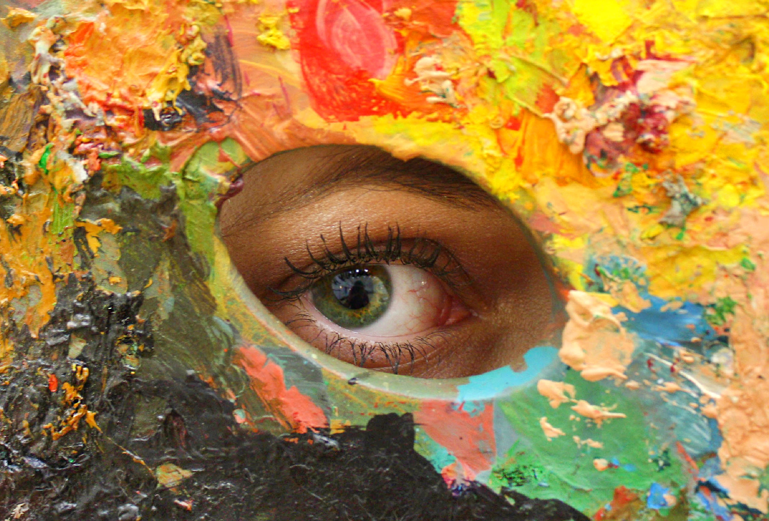
Check out this cover in the shop So, you're diving into the wild world of double vision for your album art, huh? You've got this creepy monster vibe going on – don't worry, we've all been there with our creative brainchildren! But hey, you're right, that eerie look can totally morph into something cool and expressive, like peering through the blurry veil between dreams and reality, or maybe the sonic equivalent of a head-scratching "wait, what just happened?" kind of tune. Or, you know, just the general fuzziness of a chill, spaced-out track. The musicians are the magicians here, spinning their audio tales! Now, let's peek at these image tricks you've got up your sleeve. You're spot on – there's a whole playground of ways to get that double take effect in Photoshop. First up, the "Multiply" mode! You call it simple, and you're not wrong. It's like the no-fuss, grab-and-go option for a quick visual echo. Then comes "Motion Blur," which definitely kicks things up a notch, adding this cool, drawn-out, slow-motion feel. You can really dial in the drama with that one. And ooh, the "Grain Effect in One Color Channel" – now that's where things get a little vintage and groovy! It's like your image had a wild night in the past and is still seeing double, plus you get that sweet, grainy texture. Twiddle those intensity knobs to match the musical story – I dig it! But for today's adventure, you're sticking with the "Multiply" method. Smart choice for keeping it breezy! Multiply is about applying the "Multiply" layer filter to your layers. Step 1: Duplicate the subject by selecting the subject with the selection tools(ex: Lasso Tool, Quick Selection Tool, AI Select Subject .etc.) and create a new layer from it. Step 2: Place the new layer on top of the original image layer. Apply "Multiply" layer filter to the new layer you've just created. Step 3: We are going to make adjustment now. Depends on how you want to express it, move this new layer toward left or right a little or scale it a little larger, and adjust the layer's Opacity based on the result you want. Step4: Apply the same logic and create more layer from the same subject like that. Don't forget to adjust the opacity to each layers. This is it. With multiply layer filter and opacity adjustment, it creates double vision effect easily.
Seeing Music: Exploring The Color Palettes of Genres
Music transcends auditory dimensions and taps into our multi-sensory experiences, with color playing a pivotal role, subconsciously influencing our perceptions of different genres. Each music genre has seemingly adopted its own color palette, shaping album art, promotional materials, and even live shows. But what are these color choices, and what popular albums exemplify them? Pop music, an epitome of dynamic vibes, frequently employs vibrant tonalities. The candy-floss pink of Katy Perry's 'Teenage Dream' or the bold purple of Prince’s 'Purple Rain' encapsulates its playful charm. The Rock genre, communicating unfiltered energy and intensity, is awash in deeper hues. Classic albums like AC/DC’s 'Back in Black' and The Beatles' 'The Red Album' are testaments to the genre's bold palette. Country music leans into earthy and authentic hues. The rustic greens and browns of Keith Urban's 'Be Here,' or the tranquil cream tones of Kacey Musgraves's 'Golden Hour' tap into the genre's roots. Electronic music, setting the beat for the future, embraces neon colors. Albums like Daft Punk’s 'Discovery' embody the digital, pulsating essence of this music genre through its resplendent blue shade. Hip-hop, a genre steeped in the contrast of struggle and opulence, swings towards bold blacks, whites, golds, and reds. Kendrick Lamar’s 'DAMN.' and Jay-Z/Kanye West's 'Watch the Throne' serve as excellent color samples, as they radiate power and resilience, respectively. Jazz, a genre defined by emotional depth and improvisation, opts for a traditional palette. Albums like Miles Davis' 'Kind of Blue' and John Coltrane's 'A Love Supreme' offer perfect examples with their serene hues and vintage charm. Blues, Reggae, Classical, and Metal music also have their distinct color palettes, each reflecting their unique atmospheres, themes, and emotional intensity. While these palettes don't directly influence the sound of music, they undoubtedly shape our understanding and perception of them. Colors weave visual elements into our auditory experience, allowing us to 'see' music, as we hear it. So, next time you listen to your favorite song or album, consider the colors that come to mind. How does that enrich your experience as a listener? Rather fascinating, isn't it?