Music is here to describe things we can't put in words easily. Music is here to add a boost to the meaning that we sometimes can manage to put into the lyrics. How about presenting something that is hardly describable with words? When it comes to finding the correct visual to present our next single, EP, or album release, there are many different ways to find "the one" image to go with the sound.
You can browse through the cover bank of AlbumCoverZone almost endlessly, which makes us very proud. However, finding the right album cover design for your music can still be tough. Sometimes as musicians, we can create very concrete visual representations of our songs in our minds, so much so that it can be almost impossible to find or create the exact image that is in our minds even side by side with the most talented visual artists. Other times it can be very difficult to narrow down the visual intentions to just one simply squared image.
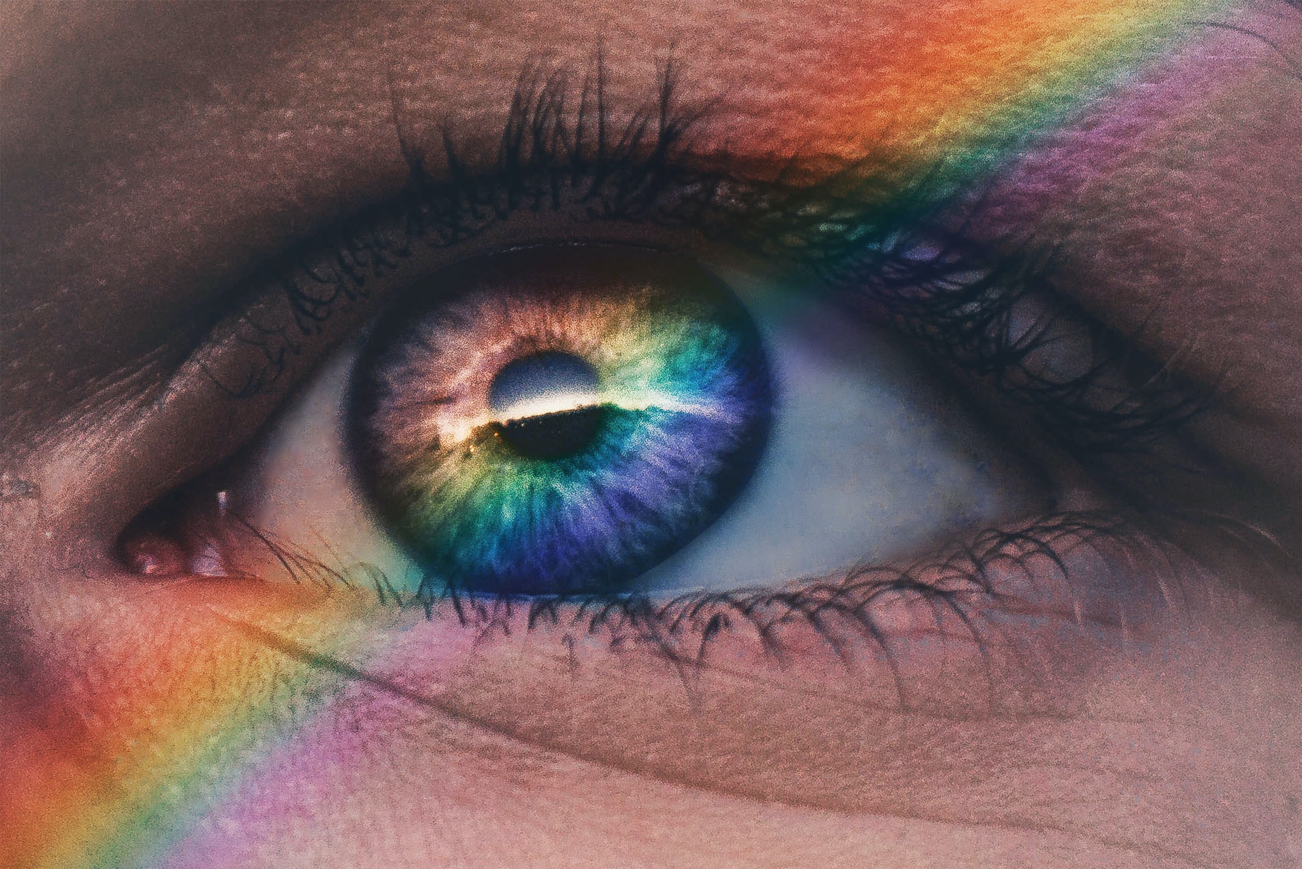
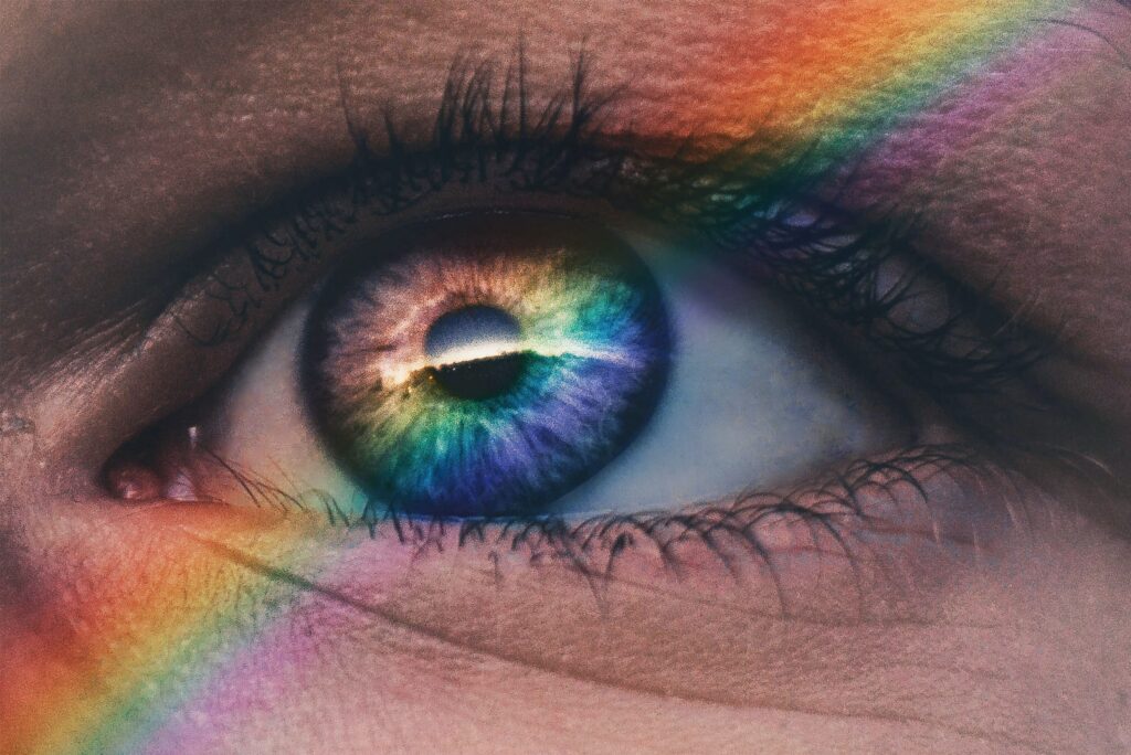
What we are going to talk about here in this article is a suggestion to musicians that are in the latter state. A very powerful and easy way to reach to a conclusion about the visual can be done by paying attention to the "colors" present in our music and then finding them on a cover design. By recognizing the meaning of the music in this very abstract way, we can establish a very strong base and look around to find the visual expression that is based on this color or colors. Do you imagine indoor lightning in your music? Is it morning hours? Is it night? You can start by simply deciding the type of light you imagine on your cover.
Colors play an important role in everyone's everyday life. We are surrounded by colors that influence our emotional and mental state. We can jump from one state to the other with the colors as well. We can distinguish brands and figure out what they are about by the color of their logos, before reading what the text in the logo says -this is one of the most practical ways of analyzing the power of colors. But we all know music doesn't work like that and we know that we can't say red is associated with power, hence it is a color for rap and not a color for pop, for example. Because all genres can transmit various emotions.
But still, think of the places that make you "feel" something, and you can start figuring out a palette of colors that come with it. Feeling trapped, feeling busy, feeling loved, feeling lonely, can be the key emotions of our songs. We can find these feelings in our memories, and we can remember the places we associate these emotions with. There’s a great chance that the colors of those places have a big weight on how we feel when we are there. Now it is time to link that color palette to the song you are working on.
Judging an album cover by its color means looking at the image outside of the first message that hits, but rather perceiving the feeling that it breathes based on the atmosphere it has. An image of a busy city avenue can give the warmest feeling, or an image of the kitchen can be the most lonely place based on the light and the color palette. Allowing yourself to find, or add, a color palette to the meaning of your music can broaden and establish your choices at the same time.
Say, if you have a love song sung from the perspective of a child that sees their parents getting separated, the first idea can be a kid, and silhouettes. But maybe the image doesn't have to have a child in it. Maybe the growth of awareness and the sadness, the individuality of the kid, all these abstracts are going to find themselves a visual presentation in an image of an old mirror or a singular object that is in a very cold environment. As long as the image gives you a sparkle about the feeling you are transmitting with your music, the audience will find it as well. The message will be given by your album cover art, not directly but in the feelings that it awakens in others.
Below in this text, you can read through a short list of colors with some emotional associations, states of mind, and various other concepts such as one’s perception of the world. Keep in mind that every culture has its own perception and interpretation, which brings beautiful variations to the richness of meanings of colors, while preparing this list, we tried to keep our sources as broad as possible. We also added tips and hints about the usage of the colors in various styles of music, and some information about what they were mainly associated with within the musical context, since at AlbumCoverZone we do analyze the past and try to figure out the future of the music scene to design not just for today but also for tomorrow.
Black
Formal; Authority; Strength; Exclusive; Power; Death; Mourning;

Darkness doesn't have to come with heaviness of the music style; it can present a mature soul. You can see very decisive albums in the pop world use dark visuals when they are about to "get real".
White
Peace; Hope; Purity; Sense of space; Innocence; Cleanliness;
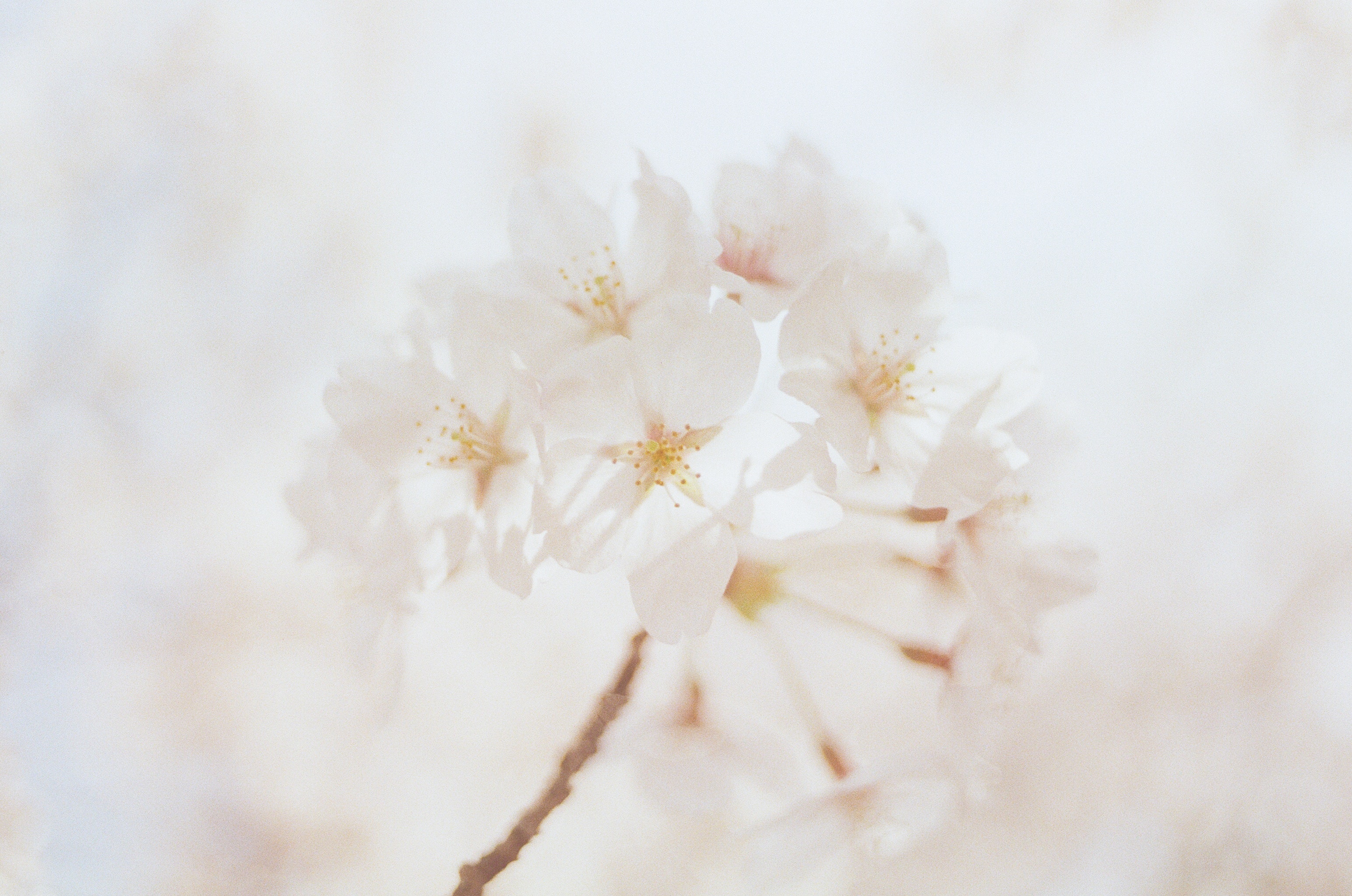
White is often associated with rather soft music but there are very powerful heavy metal and hip-hop albums that use it for its contrasting sake. Sometimes the harshest message needs to be transmitted as clearly as possible.
Gray
Neutral; Equality; Timeless; Practical; Modern; Passive;

We tend to associate grey with rather more urban albums in pop, hip-hop, alternative, and rock genres, but Kings and Queens of Folk are well known for their greyscale album covers as well. The contemporary music scene finds itself a body in the urban jungle as well, so "fresh music" is very much promised in a greyscale album cover.
Yellow
Joy; Enlightenment; Energy; Laughter; Jealousy; Optimism;

Coming from a printing tradition, yellow is often used in texts instead of white, but these years have seen yellow becoming the background; much like in the days of the LPs. Often preferred for podcasts and similar content that need to stick out from the computer screen go for yellow more than anything else.
Orange
Creativity; Enthusiasm; Warmth; Happy; Energetic; Fun;

Certainly not a color that is famous for dominating the color code of a cover, orange is also not often seen throughout the album's art history due to its "difficulty" in presenting itself both in print and early-day computer screens. The music industry still doesn't go for it as much.
Red
Lust; Warmth; Love; Romance; Excitement; Intensity;
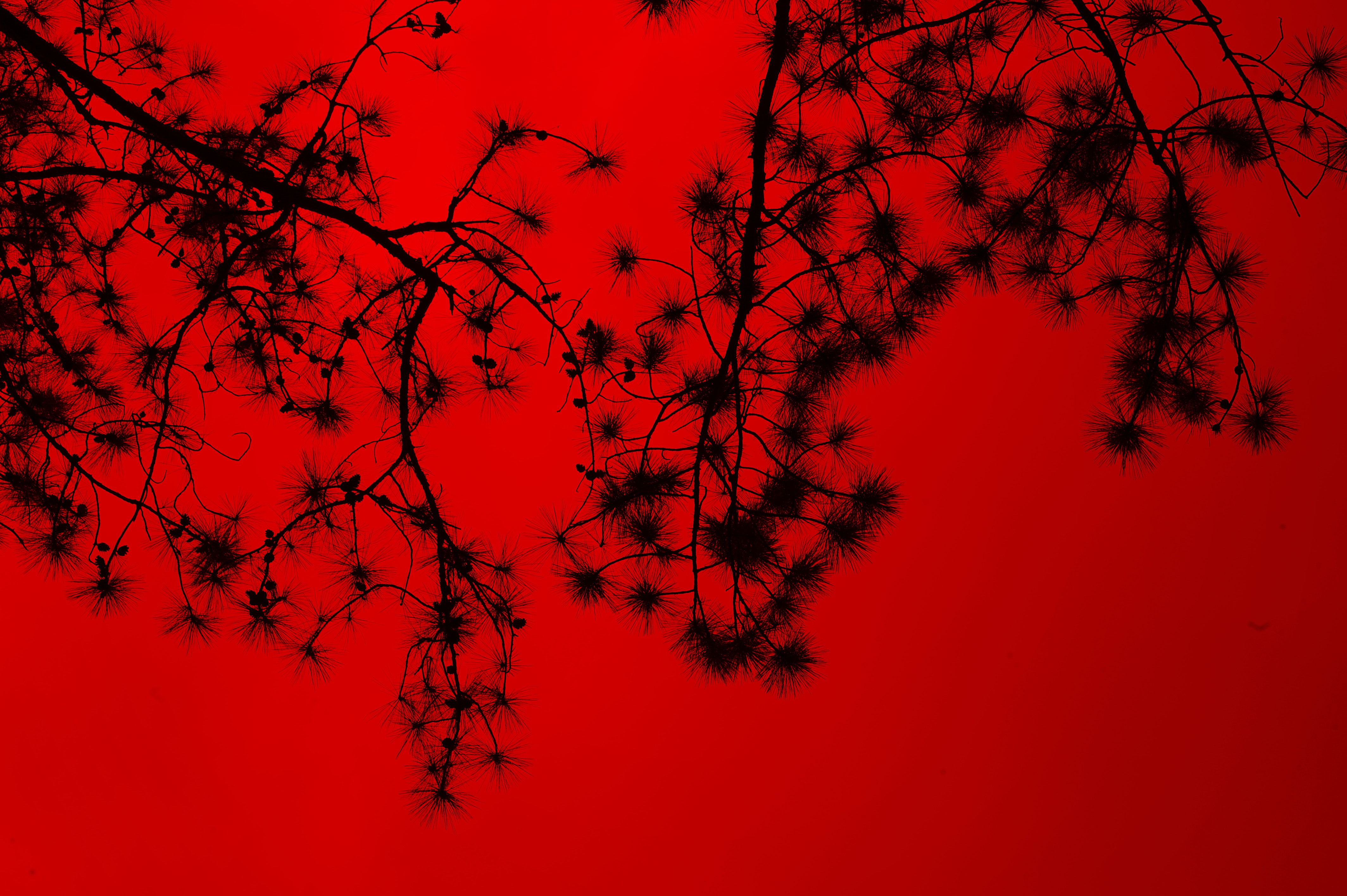
Red is found in almost every style of music when it comes to being present a little, but it is the main color of an album that still indicates a boldness that no other color can take over. From passionate in love to blood-lusting aggression, red representations can make the audience feel alerted. For good and bad.
Light pink
Love; Soft; Gentle; Calming; Affection; Sweetness;
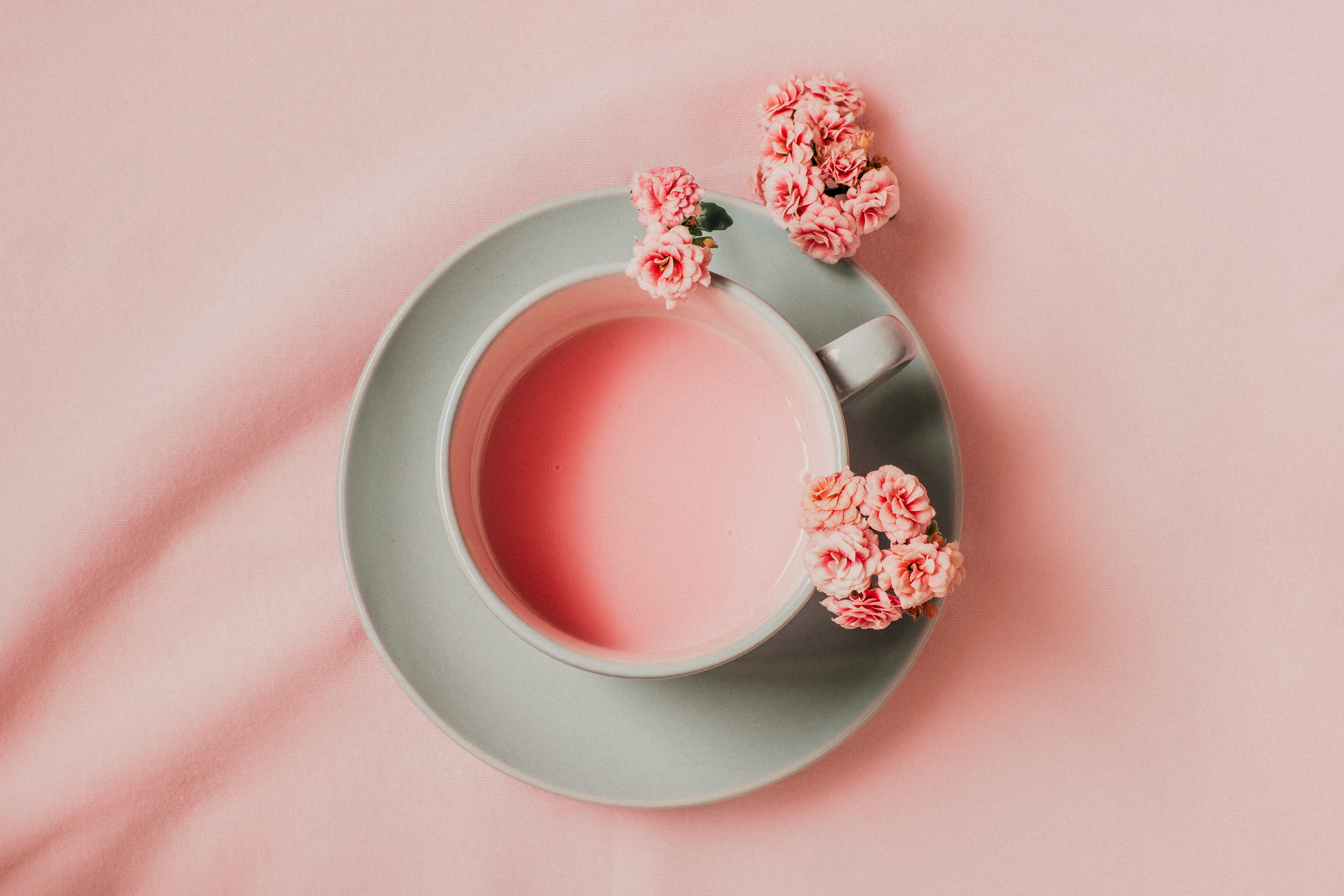
Used plenty in the folk and folk-pop scene since the revival, pink will most likely have a comeback in the near future, but these days it is not the dominant color for most styles. Its welcoming aura is found in historical context, in minimalistic folk ensembles, and in relaxing content such as meditative background music and spiritual guides.
Purple
Royalty; Wealth; Mysterious; Spiritual; Prosperity; Ambition;

Having the best romance with golden tones, purple often finds itself a place when glorious, rich, and flashy are the keywords we are looking for. Both hip-hop and classical music can be used very often. Matching it with blueish palettes hints at the gloomy, alternative, post-rock vibes of an album cover as well.
Brown
Organic; Reliability; Stability; Security; Natural; Comfort;

Maybe because of its lack of "standing out", brown is hardly seen in covers as the main element of the palette, taking the usage of actual paintings aside. But who are we to judge? The future might be full of surprises. Bringing as many organic looks to the virtual lifestyle we have these days, may come at any second.
Blue
Calmness; Serenity; Faith; Cold; Wisdom; Truth;

Blue can be pulled around to so many places; vintage, greyscale pictures, glorious skies, thunderous seas, busy cities, lakesides, it is almost as if every story we tell can have some blue in it. Shades of it will help to distinguish the meaning we are looking for.
Green
Nature; Fresh; Poison; Tranquility; Harmony; Fertility; Money;

Green never dominated the album cover design scene as much as red, white, black, blue, or yellow did. It presented itself in the most natural form; which never missed a spot in the album art design scene; the plants. Plants have their own fashion and they represent more than we can put in words very rapidly. But when it comes to green being a dominant color throughout an album cover; the possibility is that we might not be able to associate abstract with it as easily as other colors since it is such a dominant color in nature.